DESIGN THAT SPEAKS THE LANGUAGE OF EVERYDAY LIFE
- Aug 27, 2025
- 3 min read
The way we experience space, objects, and communication often depends on the quiet decisions made by designers. The choice of paper, a shade of color, the shape of a letter, or a mark on packaging shapes an experience that becomes part of our day. Three independent studios from San Francisco, Gothenburg, and Stockholm show how design turns daily life into a visual language that is recognized, remembered, and lived.
The Office of Ordinary Things (San Francisco)
The Office of Ordinary Things (TOOOT) creates identities that carry both warmth and structure. Their work for Guildford Green is built around the mascot Gilly, inspired by the classic Bialetti coffee maker. This small figure becomes the face of the brand, appearing across formats and adding a touch of everyday charm. The typography is clean and simple, while the colors are bright and direct. The visual system extends beyond the digital sphere into streets, cafés, and local communities.
A similar approach can be seen in their project for Loft Cinema. Posters and program materials are printed on carefully selected papers, with clearly specified printing techniques. With this detail, the studio emphasizes that design is not only a visual message but also a tactile experience. The same philosophy shapes the identity for Flower Architecture, where typography and signage follow the spatial flow and guide movement. For them, paper is as important as color, and the form of a letter carries the same weight as the tone of a photograph.
Lundgren+Lindqvist (Gothenburg)
The Swedish studio Lundgren+Lindqvist is known for editorial precision and clear concepts translated into every page and every letter. A recent example is the Polestar 4 Book, presented in August 2025. The publication is divided into chapters on design, testing, innovation, user experience, and presentation, each with its own visual logic. Papers layered in sequence mimic the rhythm of digital screens, allowing the reader to feel through the act of turning pages what is usually experienced on a car interface. This is design that transforms technology into a sensation under the fingertips.
For this studio, typography is never neutral. It is an extension of the idea. In their project for Blackbook Publications they developed a system where letters and composition follow the rhythm of content, while The Leporello Series demonstrates how the structure of print and format can be part of identity rather than just a technical frame.
Note Design Studio (Stockholm)
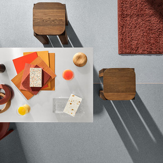
Note Design Studio builds identities through color. Their Statements Colour Palette, introduced in 2025, is inspired by objects and scenes from everyday life. Shades are drawn from the tones of wood, ceramics, textiles, and light, so each color carries a story and a context. Applied to interiors or surfaces, the palette evokes images and feelings familiar to everyone.
In the projects Formations and iQ Loop, they extend the same logic to architectural surfaces and materials. Design becomes a tool that shapes space and atmosphere, while the color palette and typographic choices function as cultural markers. Note shows that color is both an aesthetic decision and a narrative tool.
A shared thread
What unites these three studios is their ability to translate atmosphere into a system. TOOOT uses paper and material to create design that can be felt. Lundgren+Lindqvist turns technology into a physical experience through typography and the structure of books. Note uses color as the voice of everyday objects and transforms it into a tool for shaping space. Together they prove that design is present in what we touch, in what we read, and in the spaces we inhabit.


